Sensedia
Scope
NAMING
BRAND DESIGN
VISUAL IDENTITY
GRAPHIC DESIGN
Sensedia Project
The Sensedia brand was born in 2008, when we were hired by Digital Assets, a young startup specializing in SOA (Service-Oriented Architecture) solutions that was developing an API Management platform. The challenge involved creating the Brand Name, Brand Design, and Visual Identity.
In the following years, Sensedia grew sustainably, becoming a reference both in Brazil and abroad. Today, it is a global leader in API management solutions, helping companies become more digital, connected, and open, facilitating the integration of channels, partner ecosystems, and modern multi-cloud architectures.
NAMING
The naming project we developed provided several options, and among them, the name Sensedia was chosen. The name has several interesting characteristics:
Euphonic: The sound of the name is pleasant and fluid, making it easy to pronounce and remember.
Modern: The name has a contemporary touch, fitting for a technology company.
Short and Concise: With only eight letters, it is easy to recall and write.
Originality: It is unique and distinctive, avoiding common branding clichés.
Linguistic Versatility: It can be easily pronounced in different languages, which is beneficial for a global company.
DESIGN
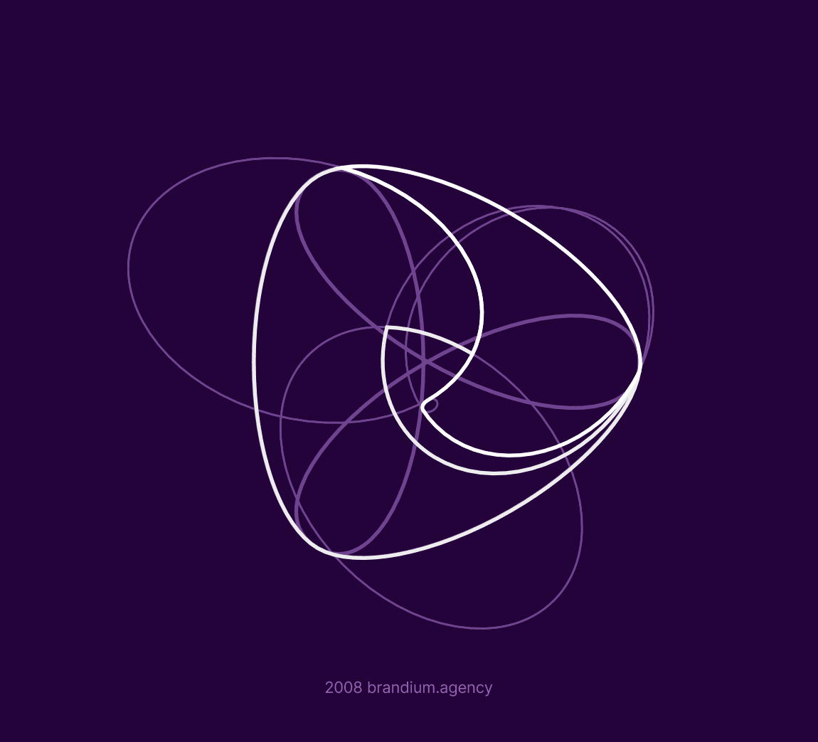
The Brand Design project aimed to represent the concepts of integration, dynamism, and renewal, without graphically over-promising. The design solution for the symbol, created in the triangular shape of an arrow with extremely rounded corners and an internal dynamism, emerges with a “brushstroke” of speed in the negative space between the orange and purple, providing a solid, balanced, and timeless solution.
The letters of the name SENSEDIA were specifically designed for the brand. The design project was conceived to ensure versatility and a wide range of graphic resources, supporting the agile production of communication and design materials in various situations.
