La Guapa
Scope
Brand Design
Visual Identity
Packaging Design
Graphic Design

La Guapa Project
First, a good EMPANADA (traditional stuffed pastry) comes from an enormous desire to please another. The value of this experience, of making and receiving, lives on, which is why empanadas have been revived and reimagined over the centuries. This is what chef Paola Carosella and Benny Goldenberg have done at La Guapa, a laidback eaterie where they sell empanadas and other delights designed for pleasure.
–
An empanada is a type of savory pastry that is popular in many Latin American countries, including Argentina and Chile. It is typically made by folding a thin dough (usually made of flour, water, and sometimes fat) around a filling of seasoned meat, vegetables, cheese, or a combination of these ingredients. The dough is usually baked or fried until it is crisp and golden brown.
–
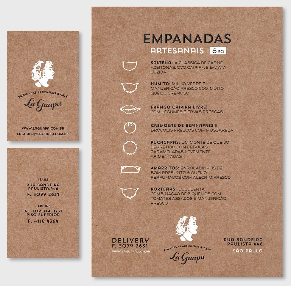
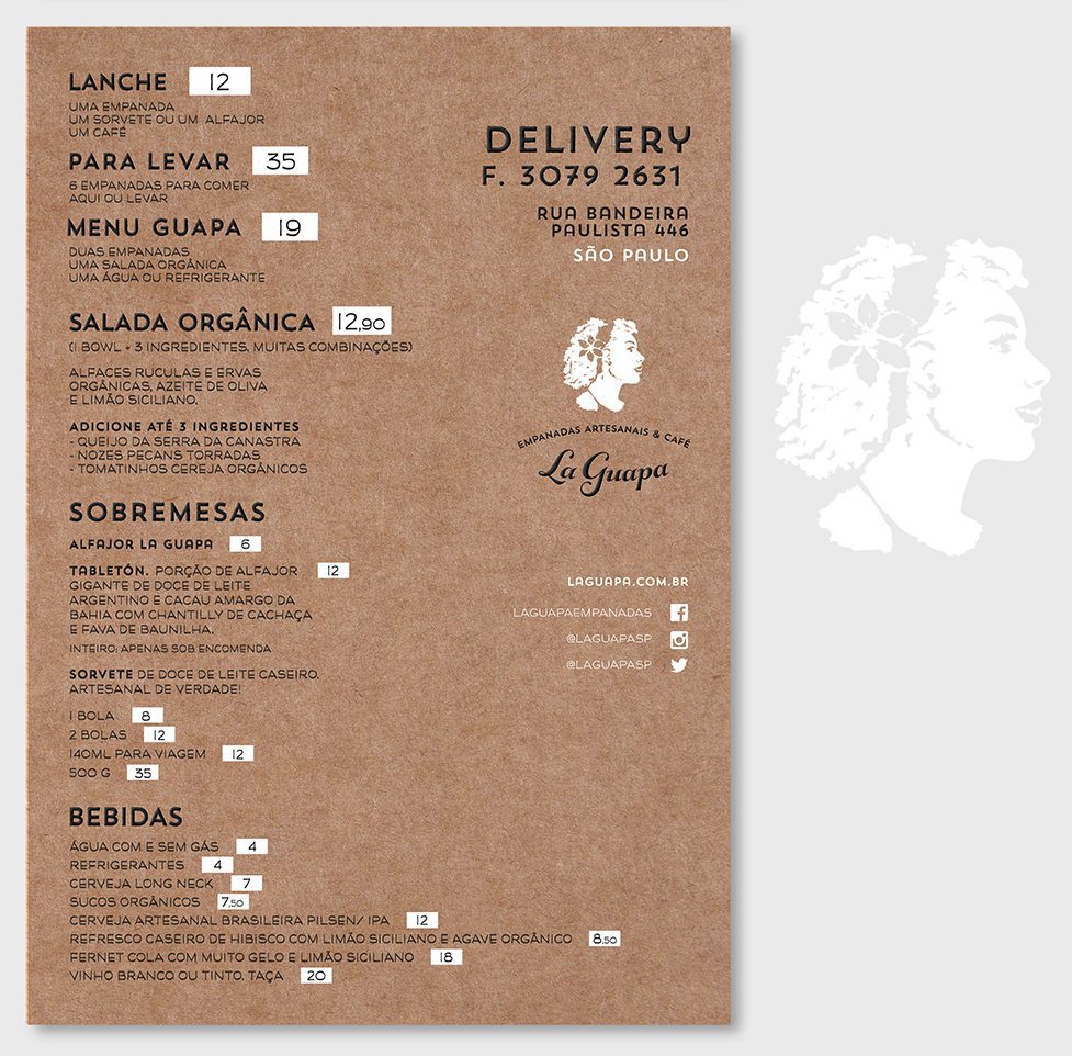
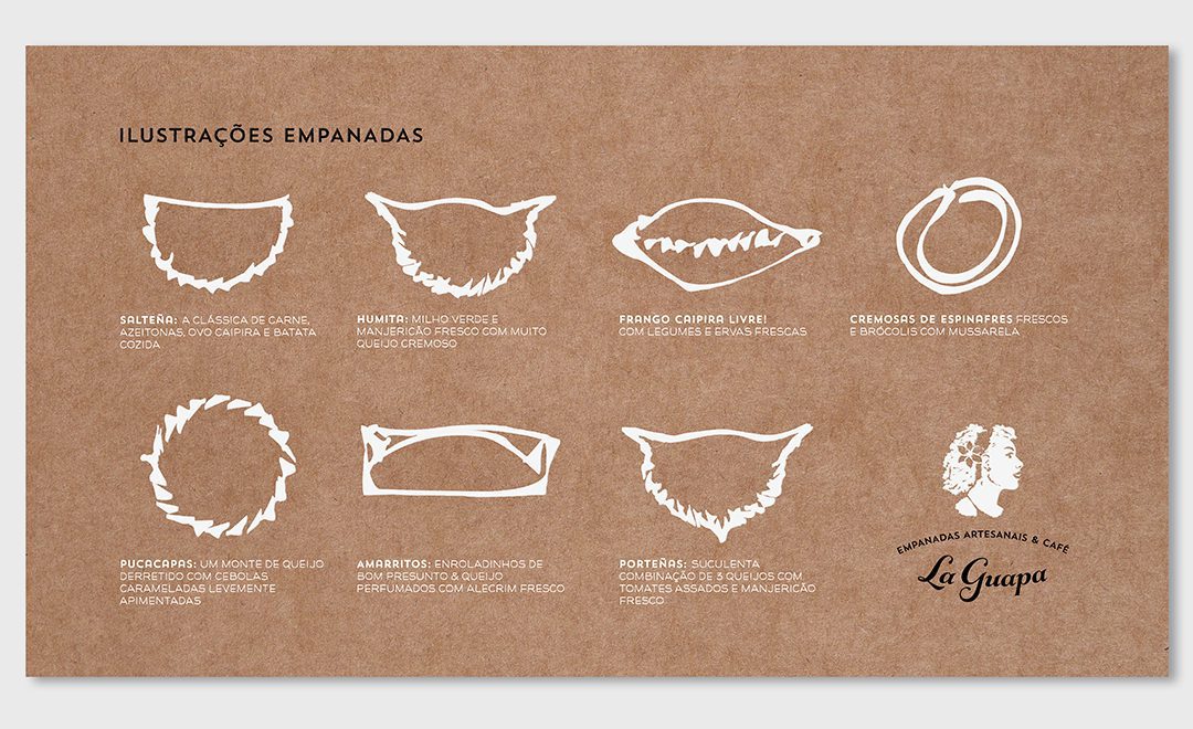
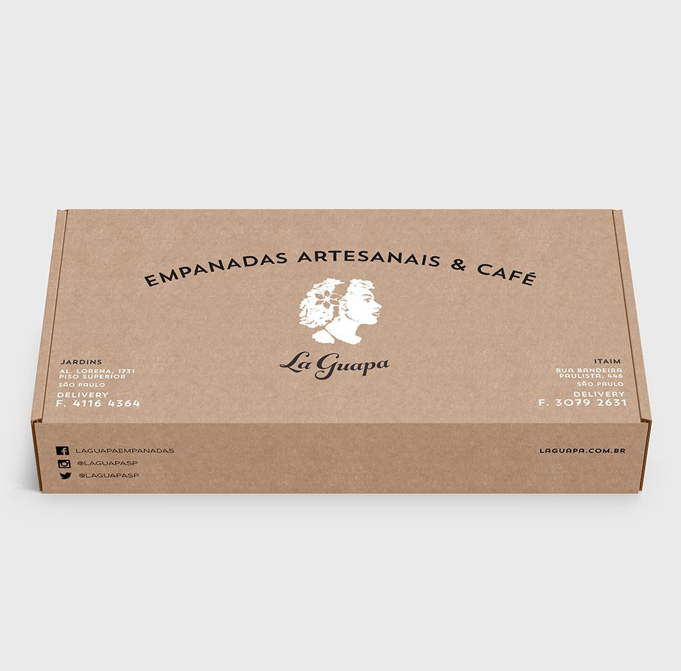
In this project, we designed the brand to support interpretation of the name, using the outline to project simplicity and a down-to-earth feel. We took the same approach to develop La Guapa’s visual identity, iconography, menus and packaging.
